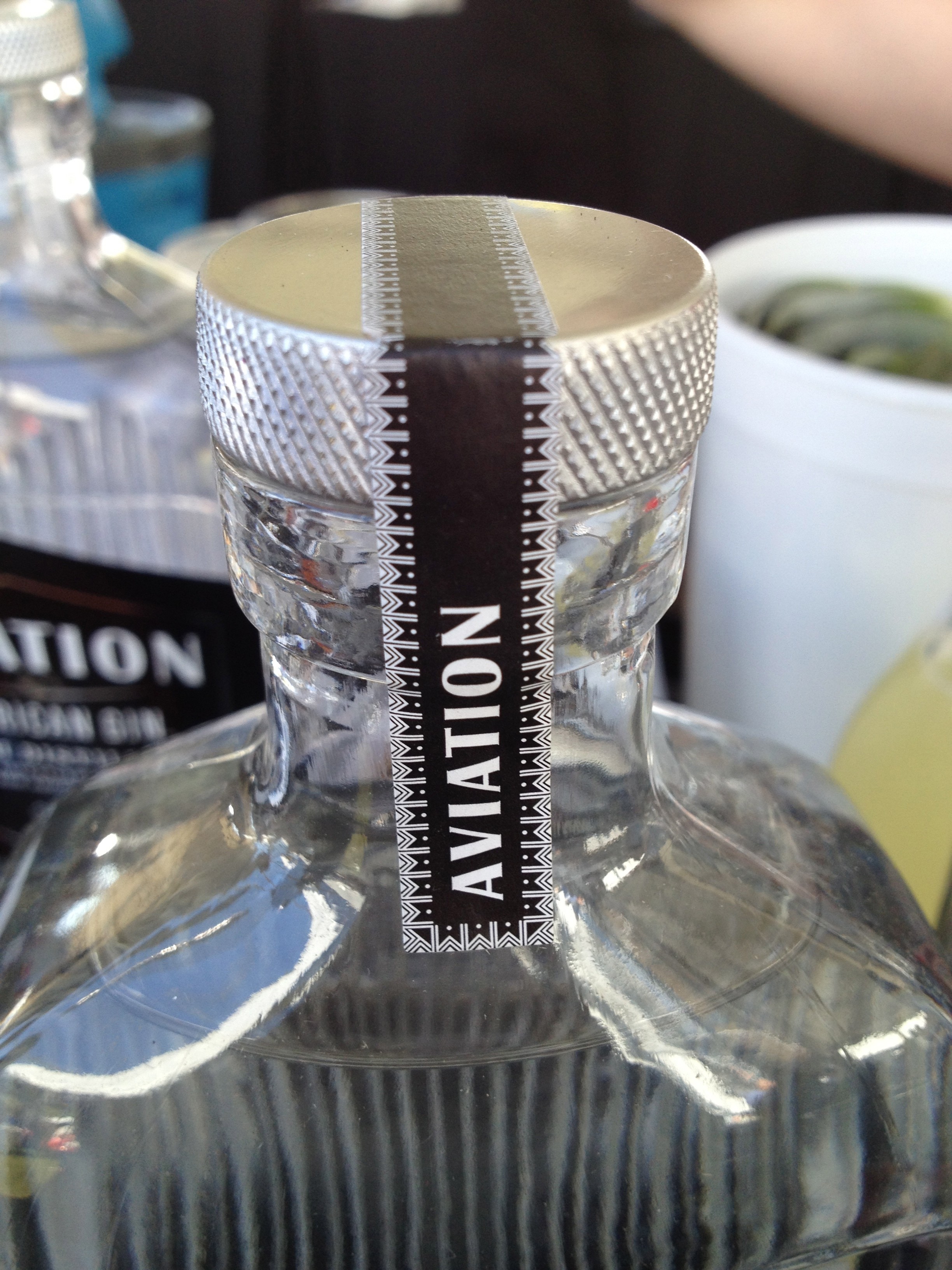
mmmm… so love it when companies really embrace the power of texture in their structural design.
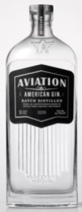
take this gorgeous aviation gin bottle as a great example…

chicago gourmet, 9.2013
the texture on the lid just compels you to want to touch it.
and i did. and it was spectacular.
the lid matched the awesomeness of the rest of the package design as well. i love the way they took something so simple but created, for me at least, such a vivid story. i can almost imagine the aviators drinking it next to their planes decorated with colorful and cleavage forward nose art back in war time.
further, i think a really successful design is when it can be both beautiful and functional – and this is a ding ding! the texture of the ridges on the bottle helps you with gripping as does the lid.