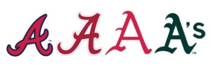
for example, have you ever noticed how close the atlanta braves “A” is to the university of alabama “A”? or even, as i was watching a baseball game between the atlanta braves and the oakland a’s and realized that although the coloring was different i wasn’t sure for a second (or maybe 10) which team was actually which (especially because they do weird themed uniforms on occasion).
this brings me to the magic of font style and i offer up the following challenge to YOU… can you name which “A” belongs to which team? and no, i am not going to give you any options but there might be a hint or three in the paragraph above. (the answers are at the end of the post but don’t cheat!)
the challenge with these many “A”‘s i would contend is that 3 of the 4 are so close to one another geographically that a sense of own-ability is pretty well lost. in focus groups, people will often say that the style of the lettering means nothing but i contend that fonts DO convey a strong sense of self and help a brand tell a cohesive and compelling story and represent the essence of a brand’s identity. here are some examples of some brands you might have heard of….
can you see how the lettering style really supports the feeling and story you attribute to the brand? would you have the same sense of product efficacy if listerine was written in the coca cola font? i would expect it to taste good but not do much for my mouth. and if the listerine font was used for tiffany & co, the delicate sophistication i associate with their jewelry would lessen exponentially.
can you think of any font styles that you have seen that captured a brand essence just so? or a lettering style that just did not feel like it matched the product? share your thoughts in the comments section. there are so many amazing examples ALL around us!
“A” key: Atlanta Braves, University of Alabama, University of Arkansas, Oakland A’s

