– graphics & structure. these must come together perfectly to capture the essence of the brand clearly, concisely, and in an aesthetically appealing way.
– package functionality. the package must function in a manner that fits with how consumers use the product. if it is too hard to use or does not do what they need the package to do, it can be considered cumbersome and not worth the head ache.
– presence on shelf. if the consumer cannot find the product on shelf or if the presentation on shelf does not support the essence conveyed through the rest of the packaging, this could easily translate to a lost sale.
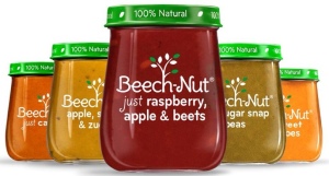
now that i have set a bit of a foundation on the topic, i wanted to bring your attention to the new beech-nut package. i am excited to report that i had two separate blog readers send me pictures of this package so i could not resist sharing it with all of you! (thanks brian and abby!)
 similar to what we were talking about with the peach and pear packaging in the recent show me the goods! posting, beech-nut is working to set expectations about their product via the clear glass and label, the “100% natural” call out on the green lid, and use of the word “just” in the product name: real, clean, simple, natural, and homemade. this is supported through language on their website as well as from their product names:
kate, this package seems awesome, why is this blog titled “hit or miss?”? thanks for asking. it looks like the package is delivering on graphics, structure, and it seems pretty solid on functionality (although maybe the glass could be a limitation for transport), but how does it translate to shelf? and here we have our potential rub.
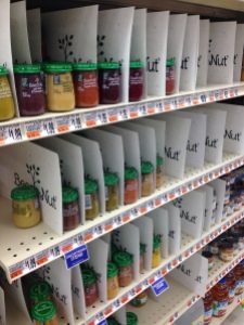
imagine you are walking down the aisle and this is what you see….
(photo credits to abby, philly area)
well, what are YOUR reactions?
for me, marketer aside, i am so distracted by the separators that the magic of the packaging is lost. all of the beauty and simplicity is totally mired in the clutter created by the paper/plastic separators (which feels way over worked and packaged). as well, you can see how weird/sad the shelf looks when the inventory is low.
above the pictures focused on just the beech-nut section but once you open it up to more of the shelf…
…for me, it feels even messier. while i totally understand the idea of trying to create a destination at shelf, which is never an easy feat, i am just not sure this is the best route.
what do you think? hit or miss?
ultimately, packaging is hard. really really hard. this is why it is such a spectacular feeling when you see a package that really really works.
can you think of other packages that in your opinion really really work or miss the mark? please share in the comment section below.


