photo

and the winner is…..

…the humane society!

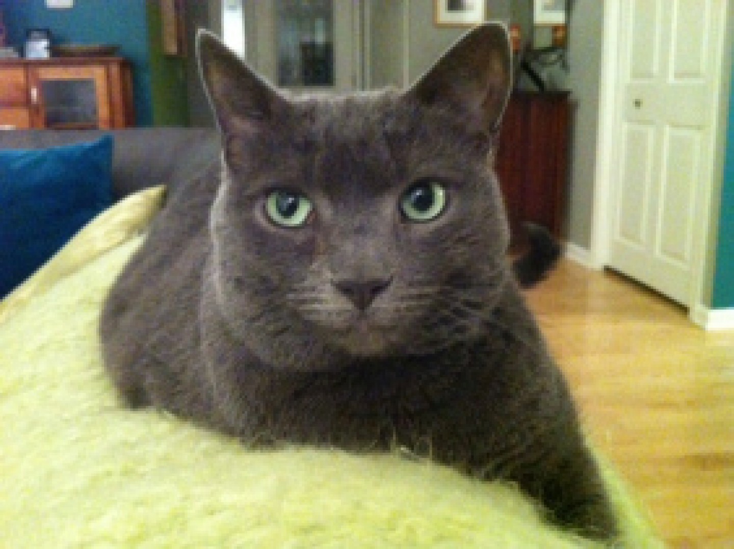
please meet ella.  super cute right? she was adopted from this local humane society by our lucky drawing winner michele.  ella is michele’s second cat from this humane society, first one named cali, and she has been so impressed by the work they do that she chose them as the beneficiary of the $500 prize money!

photo

further, michele has earmarked the donation money to be used to purchase the Stretch and Scratch cat scratchers on their shelter wish list with the remaining money going to the purchase of cat food, cat toys, and other supplies purchased to care for the cats and kittens they bring into the shelter.

great choice michele!

happy friday to all!

not sure what this is all about?  check out this previous post to gather the details: where would you donate $500?
fun with fonts

as of late i have been spending a lot more time in the south, specifically in the atlanta airport and in auburn, alabama, and have been receiving quite an education. whenever i think i have something figured out, one more detail is often added and i find myself somewhat lost again.

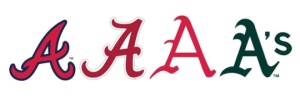
for example, have you ever noticed how close the atlanta braves “A” is to the university of alabama “A”?  or even, as i was watching a baseball game between the atlanta braves and the oakland a’s and realized that although the coloring was different i wasn’t sure for a second (or maybe 10) which team was actually which (especially because they do weird themed uniforms on occasion).

this brings me to the magic of font style and i offer up the following challenge to YOU… can you name which “A” belongs to which team?  and no, i am not going to give you any options but there might be a hint or three in the paragraph above.  (the answers are at the end of the post but don’t cheat!)

a's for blog

the challenge with these many “A”‘s i would contend is that 3 of the 4 are so close to one another geographically that a sense of own-ability is pretty well lost.  in focus groups, people will often say that the style of the lettering means nothing but i contend that fonts DO convey a strong sense of self and help a brand tell a cohesive and compelling story and represent the essence of a brand’s identity. here are some examples of some brands you might have heard of….

fonts for blog

can you see how the lettering style really supports the feeling and story you attribute to the brand?  would you have the same sense of product efficacy if listerine was written in the coca cola font?  i would expect it to taste good but not do much for my mouth.  and if the listerine font was used for tiffany & co, the delicate sophistication i associate with their jewelry would lessen exponentially.

can you think of any font styles that you have seen that captured a brand essence just so?  or a lettering style that just did not feel like it matched the product?  share your thoughts in the comments section.  there are so many amazing examples ALL around us!


“A” key: Atlanta Braves, University of Alabama, University of Arkansas, Oakland A’s

show me the goods!

there are some products that we just do not need to see.

imagine seeing potato chips in a clear bag.  i did not think that would be a popular option….although it would certainly help me step away from the bag.

the increased popularity of real people canning and pickling over the last 5 or so years is now being visually captured in your local grocery store…and i think it is beautiful!

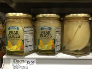
picture it, 20 minutes early for a brunch with my mom and i see a little local grocery store in a strip mall near by.  my very patient boyfriend indulges my request – – but probably more for the air conditioning than the joy of going aisle by aisle through a local grocery store.  towards the top of the aisle i see the following jars of fruit.  i might have scared him a bit.  i got pretty excited.

i am hoping that the pictures do the fruit proper credit but just in case i will describe what made me a bit giddy….  imagine a perfectly cut pear pieced together, like those orange chocolate break apart balls that are around during the holidays, so that it almost does not look cut.  this coupled with the clear label and the glass jar had me swooning!  the peaches were not quite as successful but i was still really impressed with the sense of freshness conveyed through the package design.

IMG_7960

birmingham, alabama 4.2014

IMG_7959

onto pickled goodness…  sometimes i leave my cell phone, read: camera, in the car.  that pretty much guarantees that i will see a package that i need a picture of.  this next one alluded me twice but third time was a charm!  well, umm, my neighbor had her phone so i was able to capture it for you…

photo 2chicago 8.2014

shush up.  here vlasic is working it!  the product itself looks so beautiful with the vibrant colors represented, it looks like my super green thumbed neighbor actually canned it at home, and i just feel like it will be the freshest and tastiest dill and bread&butter pickles ever.  the simplicity of the label design in terms of size, coloring, and font style works so well with the canning type lid.  i heart this package.

how are they doing in market?  in the spirit of full disclosure, i did see these products in the clearance section.  not sure why they were there but i am hoping that it does not mean that the product line is going away.  this package makes me really wish i was big into pickles.

and just because…. here is an example of some super fun pickle packaging in budapest (say that 3 times fast!)…and yes, the jar IS looking back at you….

IMG_7814

budapest, 4.2014

any packages that stand out to you as beautiful in the way they highlight the actual product contained?  i would love to hear about in the comment area below.

where would you donate $500?

if you have been following the blog then you are aware i love packaging, branding, fishing, and travel, but there is more.  one element that has always been a cornerstone to my business and my life philosophy is giving back.  kcw global research annually makes donations to organizations in its backyard, nationally, and internationally while also making small donations for every project executed and donating my time to a variety of amazing organizations when i can.  sharing this is not intended to be a “toot my own horn” moment, but rather an opportunity to share a little of my back story on the topic so you can understand the impetus behind this initiative.

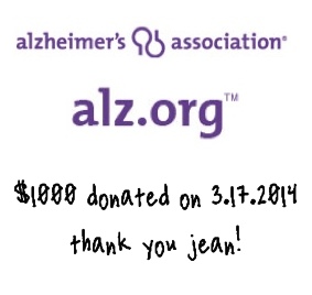
anyone can start a blog but i needed to figure out how to build this spirit of giving into this construct.  and so our story begins… back in february i held a drawing for a $1000 donation to the 501c3 of the winner’s choice.  this drawing included the 60ish of you that had subscribed to my blog within its first few months.  the beneficiary of this initial drawing was:

blog pic for alz

but kate this donation was made in march, why are you telling us about it now?

i love these questions!  i am telling this to you now because we just hit the 100 followers milestone which means we have drawing for $500 to the 501c3 of the winner’s choice coming up this week.  this time and moving forward, at every 100 follower milestone i will host a drawing and the winner will get $500 for the 501c3 of their choice!*

the intention is to give back to those of you that are supporting me in a meaningful way but also hoping to get folks thinking about where and how they can give back in their own lives.  these instances of giving back do not have to be grand or even monetary but my hope is that this might open you up a little to the many opportunities to give of yourself that are all around you.

where would YOU choose to donate your $500 if you won?  and even if you aren’t picked this time, i bet you have an idea of where you would donate it, don’t you?  regardless of whether i pick your name, take this opportunity to find a little way to give back today or this week.  this is my little challenge for all of you.

you might recall from a previous post keep calm and summer on, how my girl summer started a simple and beautiful movement to pass on love through random acts of kindness.  i dedicate this initiative to her beautiful memory.  we miss you summer!

please invite your friends, family, and colleagues to join this campaign!  imagine the impact we can make… and feel free to share your acts of goodness in the comment section below.

this drawing will be held THIS week so watch your email to see if you are the LUCKY winner!  good luck!


*fine-ish print:  this is limited to $5,000 a calendar year – but for this year that would mean 700 more followers and in a regular year 1000 followers.  if we get there i might even reconsider… but ultimately let’s not leave a single dollar on the table.  i am ready for the challenge if you are.  keep calm and summer on!