img_0237

cha-cha-cha-changes…

i am not always great with change.

sometimes it really hurts.

especially when you mess with my favorite comfort foods.

example 1: my blue box kraft mac and cheese

let’s get right to the brass tax.  i think they have shrunk the noodles.

i was so shattered at the prospect that i took this picture with the fork in the bowl (albeit a large bowl that maybe holds the entire box of mac and cheese) so i could create some context for future reference.  i know it doesn’t help.

IMG_8409


chicago, illinois 7.2014

this is…errr was one of my favorite treats on the planet.  i will spare you the rant that i did write and delete because we are focusing on the potential of smaller noodles and not my rocky relationship with kraft blue box as i work towards a healthier lifestyle.  i have not purchased or consumed any blue box since this discovery because A) healthier lifestyle dictates i steer very clear and B) the fact that they might have changed it is just too much for me to bear….

anyone else noticed this? was this a one time bit of personal confusion?

that is what i thought with example 2…but the scenario has repeated itself.

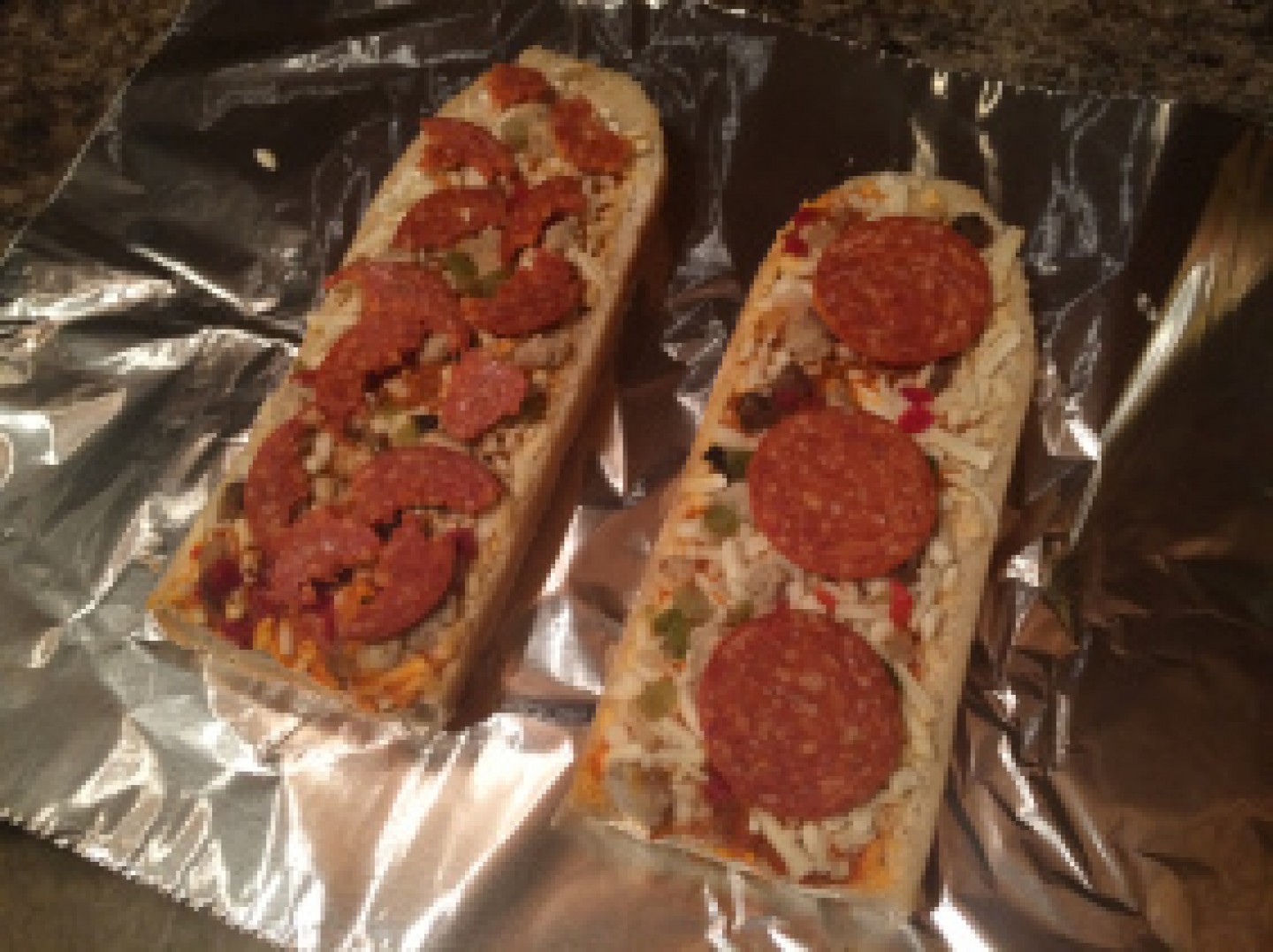
example 2: my stouffer’s french bread pizzas – deluxe

why ohh why would you stop cutting the pepperoni into quarters?  now i have to hand shred them.  sure i was always interacting with the pepperoni making sure that they were evenly distributed across the pizza but that doesn’t make your hands greasy.  shredding the pepperoni does.  it happened a few weeks ago and i prayed it was just a random mistake but then it happened again this week and i think this might be the way of the future… (candidly, i did get better pepperoni coverage but too much work.  please see an au’ natural look beside a hand shredded option…

IMG_0237

opelika, alabama 12.2014

example 3: mcdonald’s egg mcmuffin muffin

(okay, so i get that my choices of comfort foods might qualify me for a food intervention but please note that i am working to train myself to really like fruits and vegetables….very slow road…and feeling a bit of food shame right now.)

at this point i suspect that they have only switched the mcmuffin in the alabama market.  “research tastings” in airports across the country and on ashland avenue in chicago appear to still match the original recipe but we might have a switch-a-roo on our hands.  in alabama i have experienced a less bread like mcmuffin that does not really toast as well and doesn’t seem to have the same binding characteristics as

am i alone on these?  have you noticed these changes or others in the products you buy and eat?  please share them in the comment section below…
View More: http://frantz-photography.pass.us/kate-and-mac-watson

how am i still alive?

not too long ago i was faced with trying to process/re-acquanit myself with all of the food in my pantry.  this happens every few years or so and is often driven by the discovery of some pretty old expiration dates by myself or even worse, a friend.i can ramble on about the reasons behind how this happens (e.g., never home, live alone, do not cook often) but upon bringing up this issue on Facebook i learned that i am not alone.

many many of us ignore expiration dates and we are all still alive!  this was thrilling news – but maybe a bit unsettling for those of you who i cook for if you are not of this mindset.

recently, a friend’s dad shared an article about the creation of a gelatin label that could help limit waste by more accurately determining when the food has actually spoiled/gone bad.  here are some highlights from Adele Peters’ article:

“The next time you start to toss an “expired” carton of milk, consider this: Dates on packages don’t actually have anything to do with food safety or FDA regulations. Instead, the dates are a somewhat arbitrary indication of when a manufacturer thinks food might be freshest, and most food will likely be fine for days or weeks afterward.


hit or miss?

there are lots of elements that must come together for a package to be a success.  three key factors are:

graphics & structure.  these must come together perfectly to capture the essence of the brand clearly, concisely, and in an aesthetically appealing way.

package functionality.  the package must function in a manner that fits with how consumers use the product.  if it is too hard to use or does not do what they need the package to do, it can be considered cumbersome and not worth the head ache.

presence on shelf.  if the consumer cannot find the product on shelf or if the presentation on shelf does not support the essence conveyed through the rest of the packaging, this could easily translate to a lost sale.

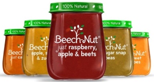
now that i have set a bit of a foundation on the topic, i wanted to bring your attention to the new beech-nut package.  i am excited to report that i had two separate blog readers send me pictures of this package so i could not resist sharing it with all of you! (thanks brian and abby!)

beechnutsimilar to what we were talking about with the peach and pear packaging in the recent show me the goods! posting, beech-nut is working to set expectations about their product via the clear glass and label, the “100% natural” call out on the green lid, and use of the word “just” in the product name: real, clean, simple, natural, and homemade. this is supported through language on their website as well as from their product names:

words

line

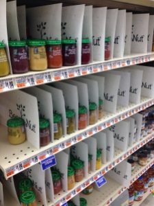
kate, this package seems awesome, why is this blog titled “hit or miss?”?  thanks for asking.  it looks like the package is delivering on graphics, structure, and it seems pretty solid on functionality (although maybe the glass could be a limitation for transport), but how does it translate to shelf?  and here we have our potential rub.

imagine you are walking down the aisle and this is what you see….

photo 2  photo 1

(photo credits to abby, philly area)

well, what are YOUR reactions?

for me, marketer aside, i am so distracted by the separators that the magic of the packaging is lost.  all of the beauty and simplicity is totally mired in the clutter created by the paper/plastic separators (which feels way over worked and packaged).  as well, you can see how weird/sad the shelf looks when the inventory is low.

above the pictures focused on just the beech-nut section but once you open it up to more of the shelf…

photo 3

 …for me, it feels even messier.  while i totally understand the idea of trying to create a destination at shelf, which is never an easy feat, i am just not sure this is the best route.

what do you think?  hit or miss?

ultimately, packaging is hard.  really really hard.  this is why it is such a spectacular feeling when you see a package that really really works.

can you think of other packages that in your opinion really really work or miss the mark?  please share in the comment section below.

photo

and the winner is…..

…the humane society!

please meet ella.  super cute right? she was adopted from this local humane society by our lucky drawing winner michele.  ella is michele’s second cat from this humane society, first one named cali, and she has been so impressed by the work they do that she chose them as the beneficiary of the $500 prize money!

photo

further, michele has earmarked the donation money to be used to purchase the Stretch and Scratch cat scratchers on their shelter wish list with the remaining money going to the purchase of cat food, cat toys, and other supplies purchased to care for the cats and kittens they bring into the shelter.

great choice michele!

happy friday to all!

not sure what this is all about?  check out this previous post to gather the details: where would you donate $500?

img_7834

sweet packaging in budapest

so i have been back from budapest for sometime now but there were two purchases of the sweet variety that are still moving around my home.  the chocolate is so delicious and special that i want to be able to make it last forever and the candy is just so pretty that i am not sure i could ever actually eat it.it is just that beautiful.

don’t believe me?  take a gander…

IMG_7836

budapest, hungary 4.2014

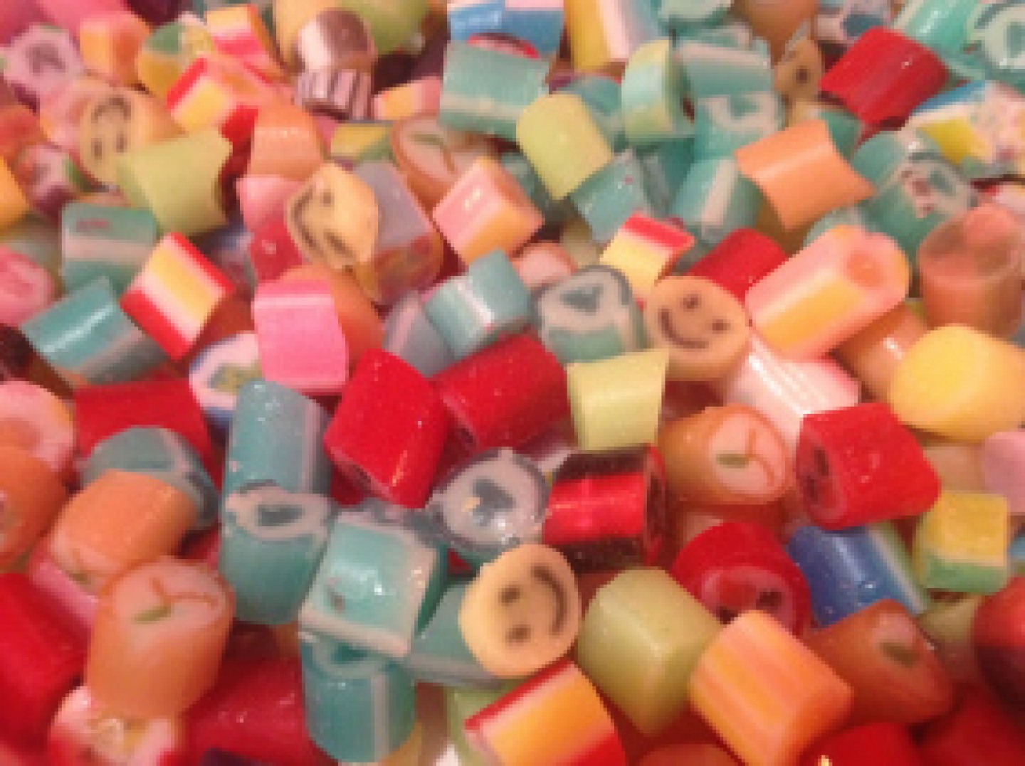
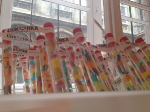
amazing right?  not only are the candies handmade but they are a mix of flavors, and therefore colors, and presented in a test tube. beyond the gorgeously simple presentation that just highlights the uniqueness and beauty of the tasty candies, we have the flavors themselves.

you might see a pink and green candy and associate that with watermelon but it could be cotton candy or cherry.  the colors mean nothing in terms of flavor.  to the US consumer this would be like having a bowl of jelly belly jelly beans where the colors mean nothing.  crazy mind-blowing.  again, the colors mean nothing.  i feel like this would be a cute novelty for US consumers for about 5 minutes and then they would insist a map to decode the flavors.

i bought a big mix bag, small bag of one flavor, and a couple of test tubes (just in case one broke in transit), and honestly, i am nervous to try them.  it is almost too much excitement and wonderment for me.  but let’s not make any mistake, the candies in the bags are to eat and the candies in the test tube will be with me till my final breath…

so these candies are the star of this tiny off the beaten track in a tiny little shop called cukorka.  please enjoy the little bags which are merchandised beautifully against a red wall with its simple red and white branding.  (for those who may not know me: i LOVE the color red…my car is red, couch is red, toe nails are red, thermos is red, ink for writing my to do list is a red fine point sharpie, my company color is red, one office wall is red…net: i am a bit of a red whore and this brand’s use of red makes me happy to my core.)

IMG_7835

with none of the labels having any english on them i am not even sure which individual flavor i bought.  thinking i might save that as a special treat for a dinner party…

and look at how beautiful the individual pieces are…just like edible fimo beads!

IMG_7834

seems that in all my excitement i never quite got to the dazzling delicious and beautiful chocolate. consider this the first of many memories of budapest…

huh?

okay, so one thing that has become abundantly clear in my qualitative research career is that i am not the norm.

i can look at the proposed package designs, advertising campaign directions, and new product concepts and know with a high degree of certainty that the one i like, is not the one that will be carried through to next steps.  (side note: a client once told me they could save millions of dollars by having me taste potential products…knowing that if i liked it, it would fail in the US. yep, quite a feather in my cap!)

i would like to point out that this does not mean i am bad at my job, as i am not hired to guess what the consumers will like, but it simply reinforces that i am so very often not their consumer target.

why this long winded introduction?  because i am about to share some products that i just do not understand…because i am not their target (she types diplomatically).


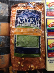
huh #1: mac and cheese loaf

not sure there is much to say on this one.  i love my starches probably more than the average bear but this feels like it might be taking the joke too far. would you add this to a sandwich? is this to be thick cut and served as a side?  i am now feeling a little regretful that i did not buy some at the time or ask more questions.  anyone have any insights on this?  please?

IMG_5194

portland, maine 8.2013

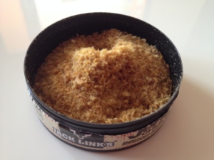
huh #2: jack link’s jerky chew, original (shredded beef jerky)

this was found in a candy store.  it was sitting beside a wide variety of innocent fun kids sugary treats.  sure when i was a kid we had both sugary and gum candy cigarettes (remember how the gum ones would even give a puff of smoke? and the candy ones had the red coloring at one end to represent the fire?)…but now i am going be a hypocrite because this just felt so wrong to me…and somehow different from those other tobacco interpretations.

do i have qualms about big league chew?  pretty much trying to mimic the same thing but in a soft foldable pack and gum not shredded beef jerky…i have no problem there either.

IMG_3601lakeview neighborhood, chicago, 2013

as i am typing this my hypocrisy on this is starting to irritate me.  so i decided to open it.  give it a taste see how it is.

it looks nothing like i expected it to (although i am not positive what i really did expect).  it has the texture of a fine saw dust.  and tastes like aged raw hide saw dust.

IMG_7635

ok, so i think it comes down to my lack of love for chewing tobacco in general.  i cannot think of another reason for this almost physical negative reaction.  the packaging is typically used for chew and when that was combined with its flavor and texture this game ended quickly for me.  sugary cigarettes had a melt to them that made them way way fun.  big league chew offered an awesome grape flavor and even fun sugary original flavor.  ultimately, earthy tasting saw dusty looking beef jerky is just not within my ideal target product set (but i am still being a hypocrite because chewing tobacco is not my thing).  but for every product, there is a consumer….right?

img_5640

creative merchandising

creativity in merchandising can be driven by different motivations.  for this post i want to focus on merchandising as a means of reinforcing brand character and as a creative approach to make a package do as it was not intended.

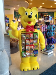
just imagine my excitement when i saw this haribo bear in the vancouver airport! an awesome example of reinforcing your fun brand personality/character.  just so fun.

IMG_5640

vancouver, canada 9.2013

however, sometimes you have to get creative.  these are bags hanging that originally were not intended to hang.  but with some folded tape and a hole punch…voila!! a lay down bag now hangs! feels like a successful tim gunn “make it work moment” to me.  well played!

IMG_2381

cancun airport 4.2012