photo

and the winner is…..

…the humane society!

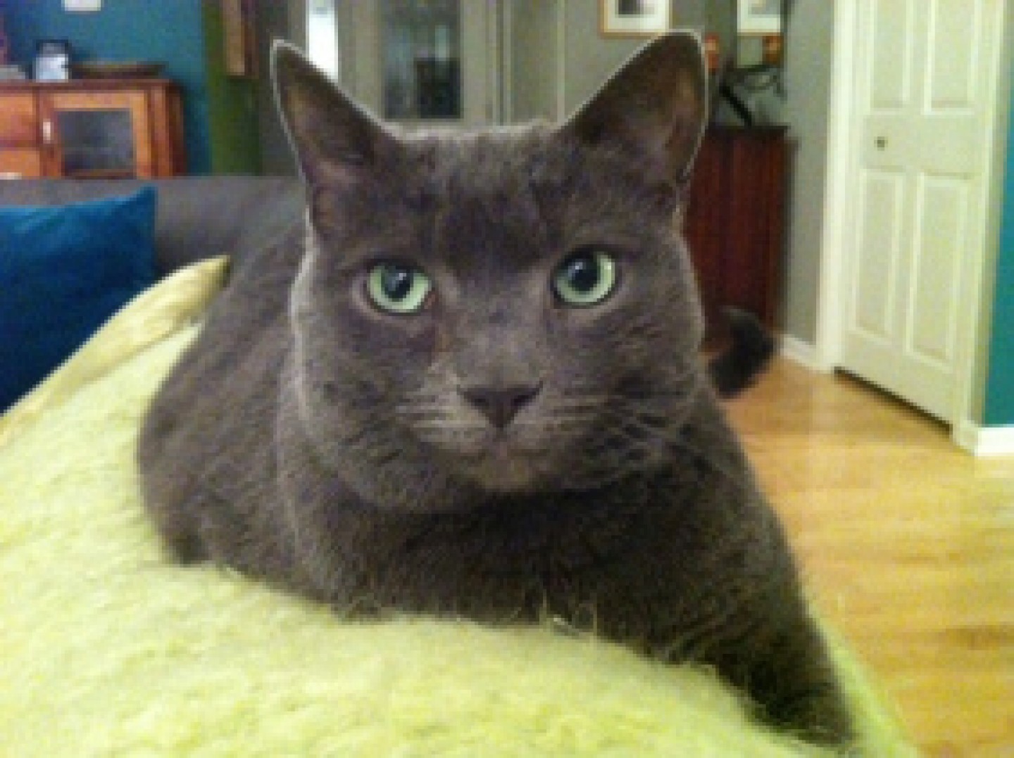
please meet ella.  super cute right? she was adopted from this local humane society by our lucky drawing winner michele.  ella is michele’s second cat from this humane society, first one named cali, and she has been so impressed by the work they do that she chose them as the beneficiary of the $500 prize money!

photo

further, michele has earmarked the donation money to be used to purchase the Stretch and Scratch cat scratchers on their shelter wish list with the remaining money going to the purchase of cat food, cat toys, and other supplies purchased to care for the cats and kittens they bring into the shelter.

great choice michele!

happy friday to all!

not sure what this is all about?  check out this previous post to gather the details: where would you donate $500?

fun with fonts

as of late i have been spending a lot more time in the south, specifically in the atlanta airport and in auburn, alabama, and have been receiving quite an education. whenever i think i have something figured out, one more detail is often added and i find myself somewhat lost again.

for example, have you ever noticed how close the atlanta braves “A” is to the university of alabama “A”?  or even, as i was watching a baseball game between the atlanta braves and the oakland a’s and realized that although the coloring was different i wasn’t sure for a second (or maybe 10) which team was actually which (especially because they do weird themed uniforms on occasion).

this brings me to the magic of font style and i offer up the following challenge to YOU… can you name which “A” belongs to which team?  and no, i am not going to give you any options but there might be a hint or three in the paragraph above.  (the answers are at the end of the post but don’t cheat!)

a's for blog

the challenge with these many “A”‘s i would contend is that 3 of the 4 are so close to one another geographically that a sense of own-ability is pretty well lost.  in focus groups, people will often say that the style of the lettering means nothing but i contend that fonts DO convey a strong sense of self and help a brand tell a cohesive and compelling story and represent the essence of a brand’s identity. here are some examples of some brands you might have heard of….

fonts for blog

can you see how the lettering style really supports the feeling and story you attribute to the brand?  would you have the same sense of product efficacy if listerine was written in the coca cola font?  i would expect it to taste good but not do much for my mouth.  and if the listerine font was used for tiffany & co, the delicate sophistication i associate with their jewelry would lessen exponentially.

can you think of any font styles that you have seen that captured a brand essence just so?  or a lettering style that just did not feel like it matched the product?  share your thoughts in the comments section.  there are so many amazing examples ALL around us!


“A” key: Atlanta Braves, University of Alabama, University of Arkansas, Oakland A’s

show me the goods!

there are some products that we just do not need to see.

imagine seeing potato chips in a clear bag.  i did not think that would be a popular option….although it would certainly help me step away from the bag.

the increased popularity of real people canning and pickling over the last 5 or so years is now being visually captured in your local grocery store…and i think it is beautiful!

picture it, 20 minutes early for a brunch with my mom and i see a little local grocery store in a strip mall near by.  my very patient boyfriend indulges my request – – but probably more for the air conditioning than the joy of going aisle by aisle through a local grocery store.  towards the top of the aisle i see the following jars of fruit.  i might have scared him a bit.  i got pretty excited.

i am hoping that the pictures do the fruit proper credit but just in case i will describe what made me a bit giddy….  imagine a perfectly cut pear pieced together, like those orange chocolate break apart balls that are around during the holidays, so that it almost does not look cut.  this coupled with the clear label and the glass jar had me swooning!  the peaches were not quite as successful but i was still really impressed with the sense of freshness conveyed through the package design.

IMG_7960

birmingham, alabama 4.2014

IMG_7959

onto pickled goodness…  sometimes i leave my cell phone, read: camera, in the car.  that pretty much guarantees that i will see a package that i need a picture of.  this next one alluded me twice but third time was a charm!  well, umm, my neighbor had her phone so i was able to capture it for you…

photo 2chicago 8.2014

shush up.  here vlasic is working it!  the product itself looks so beautiful with the vibrant colors represented, it looks like my super green thumbed neighbor actually canned it at home, and i just feel like it will be the freshest and tastiest dill and bread&butter pickles ever.  the simplicity of the label design in terms of size, coloring, and font style works so well with the canning type lid.  i heart this package.

how are they doing in market?  in the spirit of full disclosure, i did see these products in the clearance section.  not sure why they were there but i am hoping that it does not mean that the product line is going away.  this package makes me really wish i was big into pickles.

and just because…. here is an example of some super fun pickle packaging in budapest (say that 3 times fast!)…and yes, the jar IS looking back at you….

IMG_7814

budapest, 4.2014

any packages that stand out to you as beautiful in the way they highlight the actual product contained?  i would love to hear about in the comment area below.

where would you donate $500?

if you have been following the blog then you are aware i love packaging, branding, fishing, and travel, but there is more.  one element that has always been a cornerstone to my business and my life philosophy is giving back.  kcw global research annually makes donations to organizations in its backyard, nationally, and internationally while also making small donations for every project executed and donating my time to a variety of amazing organizations when i can.  sharing this is not intended to be a “toot my own horn” moment, but rather an opportunity to share a little of my back story on the topic so you can understand the impetus behind this initiative.

anyone can start a blog but i needed to figure out how to build this spirit of giving into this construct.  and so our story begins… back in february i held a drawing for a $1000 donation to the 501c3 of the winner’s choice.  this drawing included the 60ish of you that had subscribed to my blog within its first few months.  the beneficiary of this initial drawing was:

blog pic for alz

but kate this donation was made in march, why are you telling us about it now?

i love these questions!  i am telling this to you now because we just hit the 100 followers milestone which means we have drawing for $500 to the 501c3 of the winner’s choice coming up this week.  this time and moving forward, at every 100 follower milestone i will host a drawing and the winner will get $500 for the 501c3 of their choice!*

the intention is to give back to those of you that are supporting me in a meaningful way but also hoping to get folks thinking about where and how they can give back in their own lives.  these instances of giving back do not have to be grand or even monetary but my hope is that this might open you up a little to the many opportunities to give of yourself that are all around you.

where would YOU choose to donate your $500 if you won?  and even if you aren’t picked this time, i bet you have an idea of where you would donate it, don’t you?  regardless of whether i pick your name, take this opportunity to find a little way to give back today or this week.  this is my little challenge for all of you.

you might recall from a previous post keep calm and summer on, how my girl summer started a simple and beautiful movement to pass on love through random acts of kindness.  i dedicate this initiative to her beautiful memory.  we miss you summer!

please invite your friends, family, and colleagues to join this campaign!  imagine the impact we can make… and feel free to share your acts of goodness in the comment section below.

this drawing will be held THIS week so watch your email to see if you are the LUCKY winner!  good luck!


*fine-ish print:  this is limited to $5,000 a calendar year – but for this year that would mean 700 more followers and in a regular year 1000 followers.  if we get there i might even reconsider… but ultimately let’s not leave a single dollar on the table.  i am ready for the challenge if you are.  keep calm and summer on!

img_8391-2

nod to an innovator

when was the last time you experienced something and felt that it was true amazing mind blowing innovation?sadly, i am not sure it happens too often which makes it all the more inspiring when it inevitably consumes you in its awesomeness!

why is it so hard to find?  well, i think there are varying degrees of innovation.  innovation can be something small like copa’s single serving wine product that comes in a cute glass for immediate consumption or it can be like netflix changing the way we watch a show like house of cards by releasing the whole season in one swoop.  or it can be big, really really big, and this is where i want to focus for today.

this july my company, kcw global research, is so very proud and appreciative to be celebrating 8 years of helping companies sculpt brands and ideas across the world.  insane.  so excited.

to celebrate this milestone i treated myself to a fundraiser for the frontera farmer foundation which happened to be hosted by rick bayless and his wife deann in their garden at their house.

what does this have to do with innovation?

so glad you asked.

rick bayless is an innovator, of the hard core upper echelon variety.  he believes in utilizing local food in his restaurants and supporting those local farms with his frontera farm foundation.

local food kate?  really?  that says innovation to you?

ummm… you check out a fontera tortas restaurant in o’hare or the philadelphia airport where they serve locally sourced high-quality ingredients IN THE AIRPORT.  and they did not open last week.  and the food is delicious.  yep, there is a guac bar….and fresh margaritas if that is how you roll.

i really respect rick for his ability to push boundaries of what is possible, like serving “real food” in airports, and for his many efforts to actually help farmers be more effective and successful through the grants given by his foundation.

so all of the above it true but i am building up to where he blew my mind.

cascabel.

cascabel with rick bayless

cascabel, lookingglass theater, chicago 3.2012

they call it a play but it is really an experience like no other.  you sit in the audience and you watch the performers, including rick bayless, sing, act, and perform beautiful flamenco dancing and insane physical feats you would expect in a circus act all tied into a beautiful love story…but there is more!

imagine watching rick bayless cooking food on stage that so intricately links into the story line and then see him serving the characters the food he has prepared…and then having someone serve you the SAME food so you are eating it with the cast.  brilliant!  and rather delicious i might add.

he took something we are all familiar with in some capacity, theater, and made it his own.  he made it 1,000,000% rick bayless.  and this is why on my 8th anniversary i would like to share this experience with you and to challenge you to add a little more innovation into what you do and to open yourself to seeing and experiencing the spectacular innovation that is lurking around…


can you think of something you have experienced that felt innovative to you?  maybe an experience?  a bite of food?  a product?  a package?  please share in the comment section below.


interested in learning more about cascabel?  if you are in chicago or will be this month then you might be able to!  due to popular demand it is back on the stage for a second run at the lookingglass theater: http://lookingglasstheatre.org/event_page/cascabel/

img_7834

sweet packaging in budapest

so i have been back from budapest for sometime now but there were two purchases of the sweet variety that are still moving around my home.  the chocolate is so delicious and special that i want to be able to make it last forever and the candy is just so pretty that i am not sure i could ever actually eat it.it is just that beautiful.

don’t believe me?  take a gander…

IMG_7836

budapest, hungary 4.2014

amazing right?  not only are the candies handmade but they are a mix of flavors, and therefore colors, and presented in a test tube. beyond the gorgeously simple presentation that just highlights the uniqueness and beauty of the tasty candies, we have the flavors themselves.

you might see a pink and green candy and associate that with watermelon but it could be cotton candy or cherry.  the colors mean nothing in terms of flavor.  to the US consumer this would be like having a bowl of jelly belly jelly beans where the colors mean nothing.  crazy mind-blowing.  again, the colors mean nothing.  i feel like this would be a cute novelty for US consumers for about 5 minutes and then they would insist a map to decode the flavors.

i bought a big mix bag, small bag of one flavor, and a couple of test tubes (just in case one broke in transit), and honestly, i am nervous to try them.  it is almost too much excitement and wonderment for me.  but let’s not make any mistake, the candies in the bags are to eat and the candies in the test tube will be with me till my final breath…

so these candies are the star of this tiny off the beaten track in a tiny little shop called cukorka.  please enjoy the little bags which are merchandised beautifully against a red wall with its simple red and white branding.  (for those who may not know me: i LOVE the color red…my car is red, couch is red, toe nails are red, thermos is red, ink for writing my to do list is a red fine point sharpie, my company color is red, one office wall is red…net: i am a bit of a red whore and this brand’s use of red makes me happy to my core.)

IMG_7835

with none of the labels having any english on them i am not even sure which individual flavor i bought.  thinking i might save that as a special treat for a dinner party…

and look at how beautiful the individual pieces are…just like edible fimo beads!

IMG_7834

seems that in all my excitement i never quite got to the dazzling delicious and beautiful chocolate. consider this the first of many memories of budapest…

huh?

okay, so one thing that has become abundantly clear in my qualitative research career is that i am not the norm.

i can look at the proposed package designs, advertising campaign directions, and new product concepts and know with a high degree of certainty that the one i like, is not the one that will be carried through to next steps.  (side note: a client once told me they could save millions of dollars by having me taste potential products…knowing that if i liked it, it would fail in the US. yep, quite a feather in my cap!)

i would like to point out that this does not mean i am bad at my job, as i am not hired to guess what the consumers will like, but it simply reinforces that i am so very often not their consumer target.

why this long winded introduction?  because i am about to share some products that i just do not understand…because i am not their target (she types diplomatically).


huh #1: mac and cheese loaf

not sure there is much to say on this one.  i love my starches probably more than the average bear but this feels like it might be taking the joke too far. would you add this to a sandwich? is this to be thick cut and served as a side?  i am now feeling a little regretful that i did not buy some at the time or ask more questions.  anyone have any insights on this?  please?

IMG_5194

portland, maine 8.2013

huh #2: jack link’s jerky chew, original (shredded beef jerky)

this was found in a candy store.  it was sitting beside a wide variety of innocent fun kids sugary treats.  sure when i was a kid we had both sugary and gum candy cigarettes (remember how the gum ones would even give a puff of smoke? and the candy ones had the red coloring at one end to represent the fire?)…but now i am going be a hypocrite because this just felt so wrong to me…and somehow different from those other tobacco interpretations.

do i have qualms about big league chew?  pretty much trying to mimic the same thing but in a soft foldable pack and gum not shredded beef jerky…i have no problem there either.

IMG_3601lakeview neighborhood, chicago, 2013

as i am typing this my hypocrisy on this is starting to irritate me.  so i decided to open it.  give it a taste see how it is.

it looks nothing like i expected it to (although i am not positive what i really did expect).  it has the texture of a fine saw dust.  and tastes like aged raw hide saw dust.

IMG_7635

ok, so i think it comes down to my lack of love for chewing tobacco in general.  i cannot think of another reason for this almost physical negative reaction.  the packaging is typically used for chew and when that was combined with its flavor and texture this game ended quickly for me.  sugary cigarettes had a melt to them that made them way way fun.  big league chew offered an awesome grape flavor and even fun sugary original flavor.  ultimately, earthy tasting saw dusty looking beef jerky is just not within my ideal target product set (but i am still being a hypocrite because chewing tobacco is not my thing).  but for every product, there is a consumer….right?

summers-selfies

keep calm and summer on!

summer's selfies!now that i have your attention, let me tell you a little about my girl summer.  may 15th she posted this picture on facebook with the following caption:

“Well in princess crazy world, when you brush your newly grown back hair and it comes our in large chunks you have 2 choices you can let it ruin your day or turn yourself into a human potato head and try facial hair selfies.  I chose the latter.”

she epitomizes beauty and love and has been fighting breast cancer with inspiring grace and unbelievable humor.

have you known someone who has fought an epic battle?  do you recall feeling a sense of helplessness?  it seems that we are not alone.

so what does one do when they feel helpless?  well, in the teachings of my girl princess crazy, we work hard to put more love and kindness into the world.

i challenge all of you to do two things…

  • start looking for occasions when you can practice a random act of kindness and DO IT!  offer someone else who looks exhausted your seat on the train/bus, pay for the person in line after you in the drive through, give a stranger a card wishing them a most spectacular day or even just say it and mean it!  the options are endless…
  • pass this on.  encourage others to take a moment in this crazy fast paced world to step back and share a smile or jump on an opportunity to do something unexpected and nice for someone else.

there is no real way for me to properly convey the strength and awesomeness of summer.  she lives in bloomingdale, il and the city has designated this friday, june 6th as “Keep Calm and Summer On” Random Act of Kindness Day.

to learn more about our tenacious summer and to join the facebook movement for this event this friday, click on summer’s RAOK event !  feel free to share your random acts of kindness with me or with summer as we are working to compile a book for summer that includes the myriad of gestures made in her honor across the globe.  be a part of the magic!

i think amy said it best…

“Please join the movement of random acts of kindness for my dear friend Summer. For those that haven’t had the pleasure of knowing her, think of the best person you know and that’s her. It would mean so much to her if all over the country and world people were doing nice things for other people in honor of her life. Keep Calm and Summer On.”

keep calm and summer on princess crazy!  with boundless love….

a tale of two bunnies

so while i was “working” in paris a couple of years ago, i came across the package below.

IMG_7194

paris 5.2012

you may be able to appreciate my shock and awe as i saw this bunny and thought “ohh duracell, really?”

but then, i started to dig a little deeper.

much to my surprise i learned that the duracell bunny actually came first and is still going strong in europe and australia.  there was a time when duracell did have the bunny trademarked in the US and canada but it lapsed and energizer jumped in and claimed the bunny as their own.

bunnies

i am still a loyal energizer consumer with my own properly outfitted energizer bunny in my office, but this whole story broke my heart just a little….


gratuitous fish porn

there is no real purpose of this blog posting except to share these two beautiful steelhead with you.

20140424_105214-1 dowagiac river, michigan 4.24.2014

20140424_153605-1

i caught them a couple of weeks ago and i am still glowing.  i am sure you cannot imagine why.

first one was caught with a spey rod (my first time!) and the second nymphing….

special shout out to my trusty guide dustan with ripple guide service!  perfect day!