a tale of two bunnies

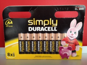
so while i was “working” in paris a couple of years ago, i came across the package below.

IMG_7194

paris 5.2012

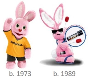
you may be able to appreciate my shock and awe as i saw this bunny and thought “ohh duracell, really?”

but then, i started to dig a little deeper.

much to my surprise i learned that the duracell bunny actually came first and is still going strong in europe and australia.  there was a time when duracell did have the bunny trademarked in the US and canada but it lapsed and energizer jumped in and claimed the bunny as their own.

bunnies

i am still a loyal energizer consumer with my own properly outfitted energizer bunny in my office, but this whole story broke my heart just a little….
 

img_2540

oui s’il vous plaît

picture it.rainy day in paris and you stop into a cute little cafe to have a bit of a nosh with some heart healthy wine.

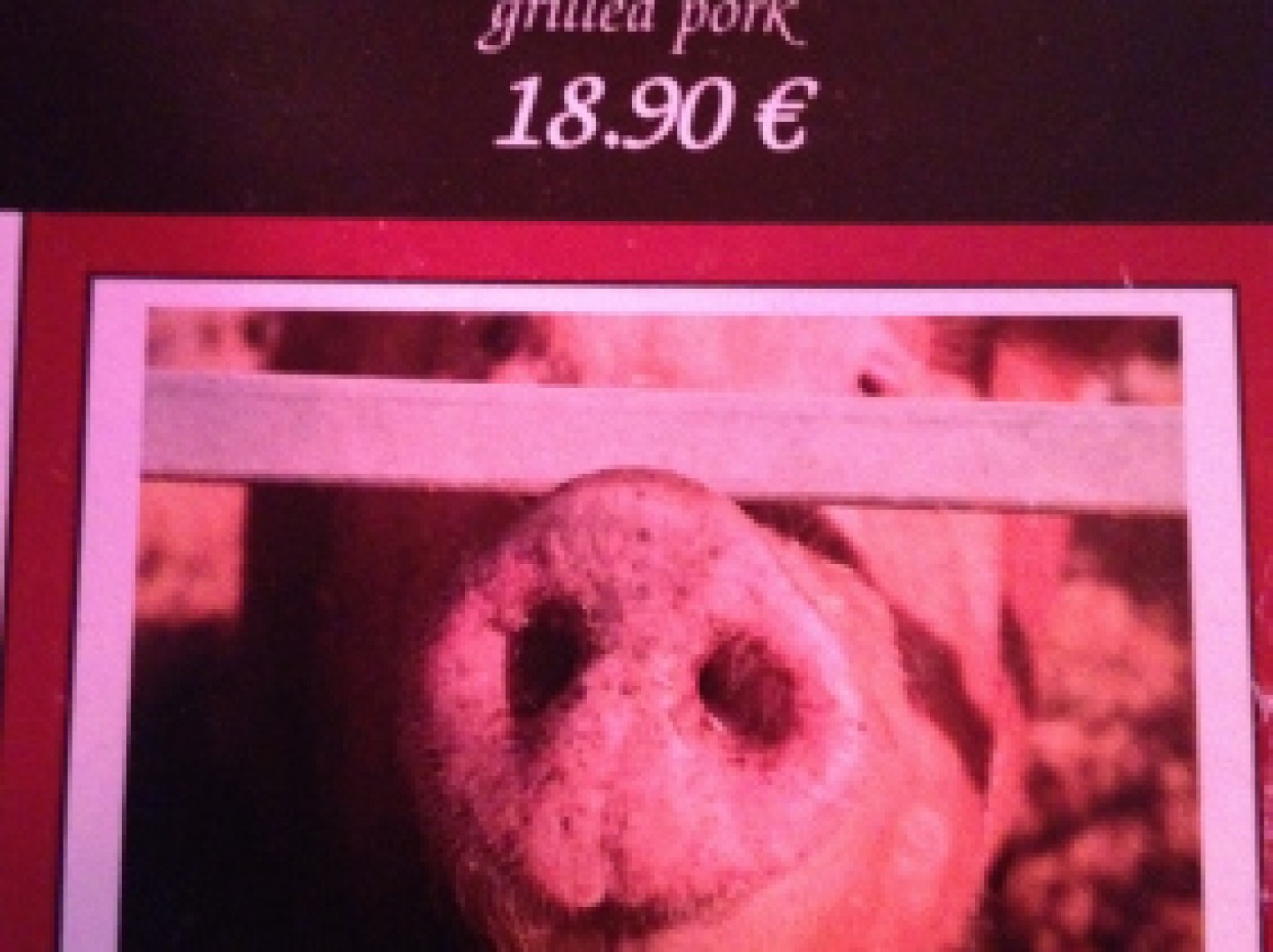
you settle into your chair and start perusing the menu and see this as an option….

IMG_2540paris 5.2012

i must say it wasn’t quite what i was expecting.  oddly, this was the only item on the menu that brought the core ingredient back to its roots.

beyond their choice to include a LIVE pig, i found their actual choice of pig visual a bit disturbing.  sort of glad there is no eye contact but he looks as if he is asking for you to please not order the grilled pork through his prison bars.

i obliged.  the steak was delicious.


IMG_7209

lost in translation

one of my favorite things to look for, especially in asia, is the way they use the english language on packaging, shirts, or just anything that can be printed!

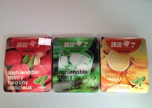
example #1: mint package

IMG_7209

shanghai, china 9.2013

pure gold!  why?  well, because it is….

–       fashionable

–       minty

–       healthy

–       delicious

kidding aside, it is amazing to see the influence of the english language.

and here is another example that i had to own: a cd case that says on the front “Don’t pay attention to all the static.”  seems totally normal-ish right?  the plot thickens…  on the side where it looks like it has the item number and such (that little bit of orange on the right edge of the case) it continues to say… “HAPPY MUSIC, BER15120, A bird in the hand is worth two in the bush.”  this appears to be a very very deep cd case.

IMG_7232

tokyo, japan 2002

and yes, of course i have more.  the topic choices and mixing of messages never gets old. enjoy these beauties…

IMG_5872

chinatown, singapore 11.2013

in case you cannot read them…

– Good good study   day day up

– Sleep whenever he woke up / Count the money a few hand cramps

– REWARD MY MOST MY MOST BEAUTIFUL WIFE

– STUDY HARD EARN MONEY

– (and one not included in this batch..) DO IT AND I RELAX

img_5640

creative merchandising

creativity in merchandising can be driven by different motivations.  for this post i want to focus on merchandising as a means of reinforcing brand character and as a creative approach to make a package do as it was not intended.

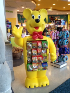
just imagine my excitement when i saw this haribo bear in the vancouver airport! an awesome example of reinforcing your fun brand personality/character.  just so fun.

IMG_5640

vancouver, canada 9.2013

however, sometimes you have to get creative.  these are bags hanging that originally were not intended to hang.  but with some folded tape and a hole punch…voila!! a lay down bag now hangs! feels like a successful tim gunn “make it work moment” to me.  well played!

IMG_2381

cancun airport 4.2012

FullSizeRender

for the love of spam

my father is addicted.he has been for most of his life.

it isn’t uncommon.

he isn’t alone.

i have even been known to take a little jaunt down the rabbit hole as well.

and i bet you have as well.

yes, i am talking about spam.

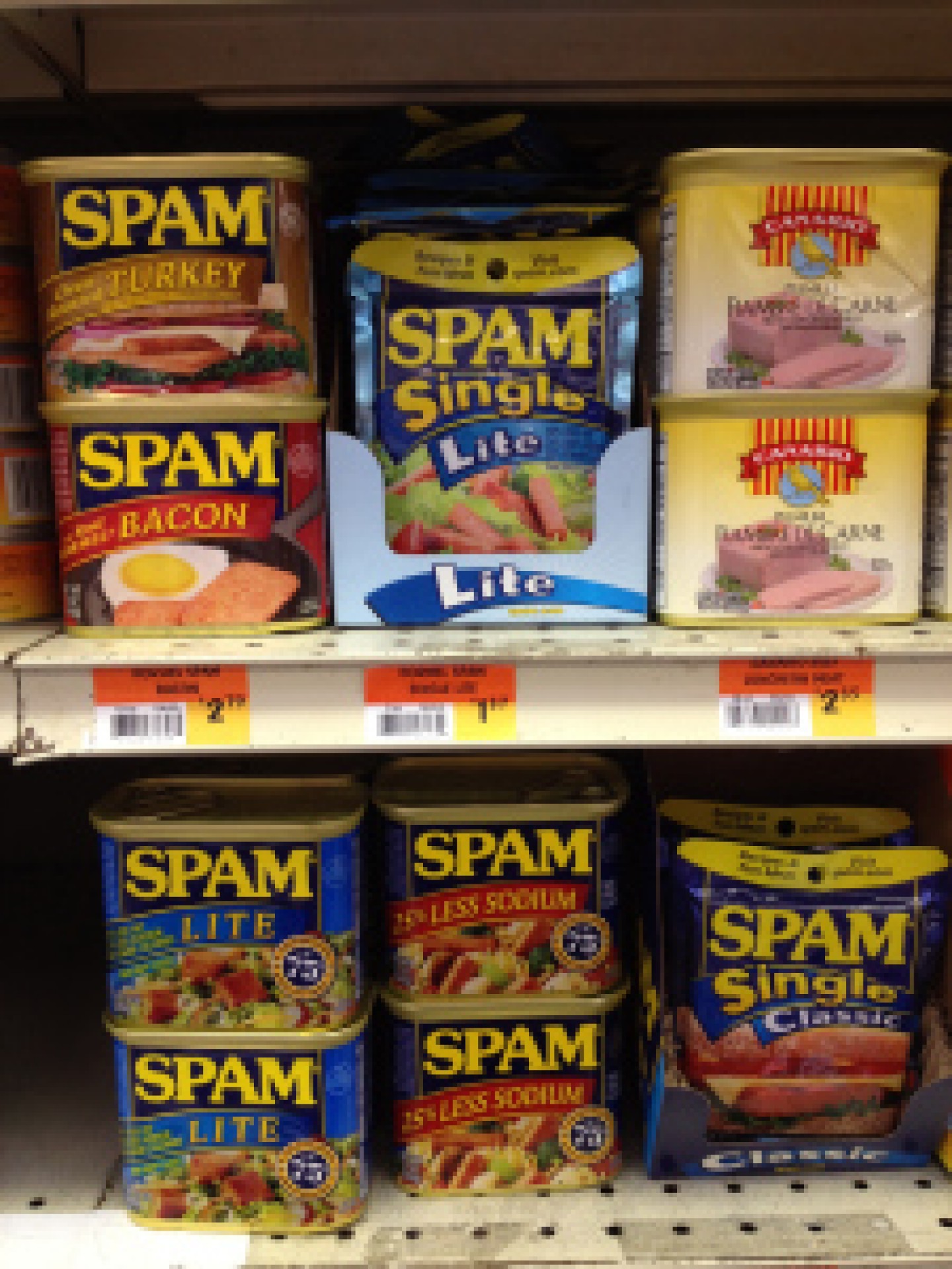
IMG_3951

(old san juan, puerto rico 1.2013)

i honestly, cannot think of another brand that brings me the same level of joy.  sure it is mostly rooted in nostalgia and family jokes/jabs but i am continuously amazed by the new innovations they bring to spam.  not sure you can read the products well in the pictures so here is the spam sum up from this particular store…

– spam oven roasted turkey

– spam with real hormel bacon

– spam light/spam light single

– spam 25% less sodium

– spam classic single

truly, i am not even sure what the first two are but i can say that they make me deliriously happy!

thank you spam!  keep it up!

IMG_5642

ooooooh…. texture

mmmm… so love it when companies really embrace the power of texture in their structural design.

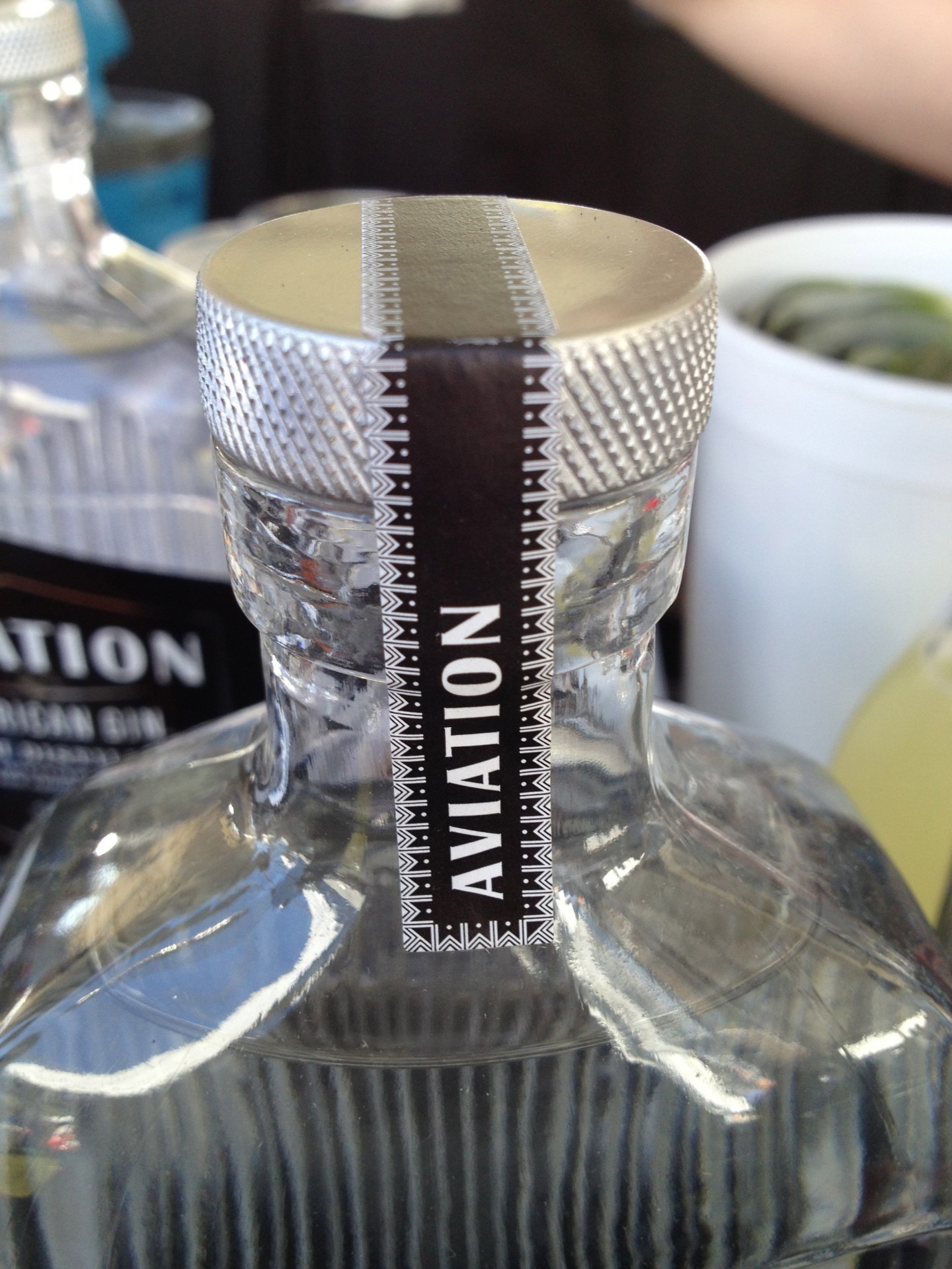
take this gorgeous aviation gin bottle as a great example…

IMG_5642

chicago gourmet, 9.2013

the texture on the lid just compels you to want to touch it.

and i did.  and it was spectacular.

the lid matched the awesomeness of the rest of the package design as well.  i love the way they took something so simple but created, for me at least, such a vivid story.  i can almost imagine the aviators drinking it next to their planes decorated with colorful and cleavage forward nose art back in war time.

aviation

further, i think a really successful design is when it can be both beautiful and functional – and this is a ding ding!  the texture of the ridges on the bottle helps you with gripping as does the lid.

img_3976

best.rice.package.ever.

finding it hard to believe that a box of rice could get you excited?!if yes, then clearly you have never been rice shopping in san martin, argentina.

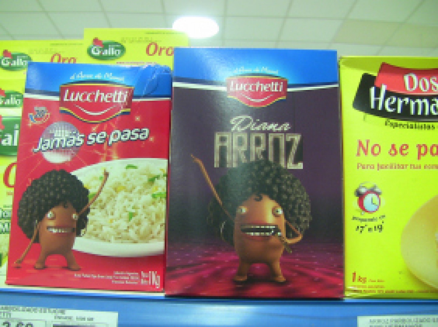
the success of this particular package is not really driven by traditional measurements but by the sheer fun and craziness of it.

am i building up enough excitement and anticipation yet?

ladies and gentlemen i present you with lucchetti’s diana arroz.

IMG_3977

san martin, argentina 3.2012

yes, this package really exists.  awesome right?  but wait.  it gets better.  the advertising campaign that accompanies the package takes us all to yet another level i am not sure i knew even existed.

check it out…. i promise you will not be disappointed…

you are so very welcome!